Two Line
Task: Create a minimalistic graphic using software (Adobe Illustrator) and only two lines and three colors maximum. Once complete create a second graphic that advances the first graphic almost to the point of being unrecognizable.
Planning: For my project I wanted to do something in relation to the Army. The concept of the project revolves around the Gestalt Principal. The Gestalt Principal summarized basically means that less is more. This is shown in this project due to only using two lines and the limited amount of colors/effects on the first version. Therefore I picked a tank because it is very recognizable and can easily be linked to the army. Two lines of text were also allowed to be used. To further make it more recognizable I placed the words "Army Strong". With the other line I had available, I chose to also implement a star behind the tank. This adds to the image and makes also makes it more recognizable because the army emblem/logo has a star. On the other side of the spectrum is the second version of the project. On this version any amount of effects, and visuals could be used. However the same two lines of text, colors, and lines had to remain constant. On this one I chose to use a 3d effect which I think added to the graphic in a positive way.
Strengths: I think that my overall project is easily identifiable and appealing to look at. I also like how the tank is still easy to see even with the star in the background. I also feel that I did well constructing the image by simply using two lines.
Weaknesses: Overall I feel like everything went well, however if I could redo this project I would try to do more things with the second variant of the image.
Commencement Cover
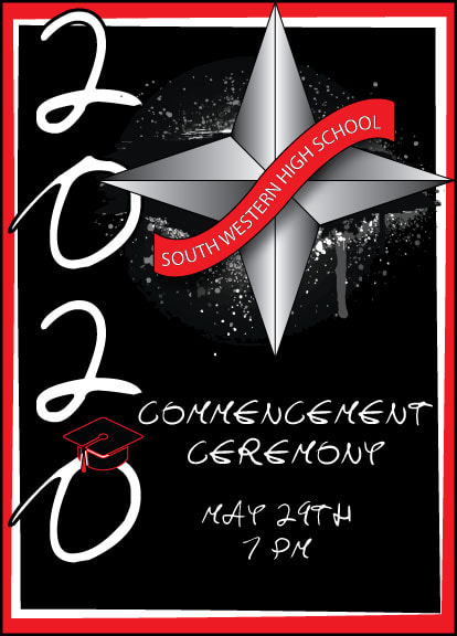
Task: Develop a cover for the 2020 Commencement Program.The cover needs to be completed in portrait, the size of the Student Handbook & Commencement Program is 5 3/4” x 8”, the cover should be appropriate since each student and or parent will receive a copy, and the title of the cover should be clear and understandable.
Planning: For this project I had to think of a way to make something that both represented the school but also had to do with a graduation theme. I chose to place "2020" as the main focus to represent the class of 2020. On top of that I placed a graduation cap on the last 0 to further identify it as a graduation theme. This project was hard because not only did it have to appeal to teachers but also to kids. I chose to represent the school by placing a southwestern banner in front of the compass also associated with the school. To make it appeal to the kids I placed a paint splatter type image behind the compass. This made the cover look more appealing to the eye in my opinion. I also tried to keep it fairly simple with the main school colors. I didn't want the colors to take away from the title "commencement cover" so I positioned them around the border.
Strengths: Overall I think the cover is cool to look at and gives the message that it is a commencement cover. This was achieved through the large 2020 and graduation cap, along with the title.
Weaknesses: I think that I should have done something more "professional" so that it would appeal to the teachers more.
Athletic Schedule
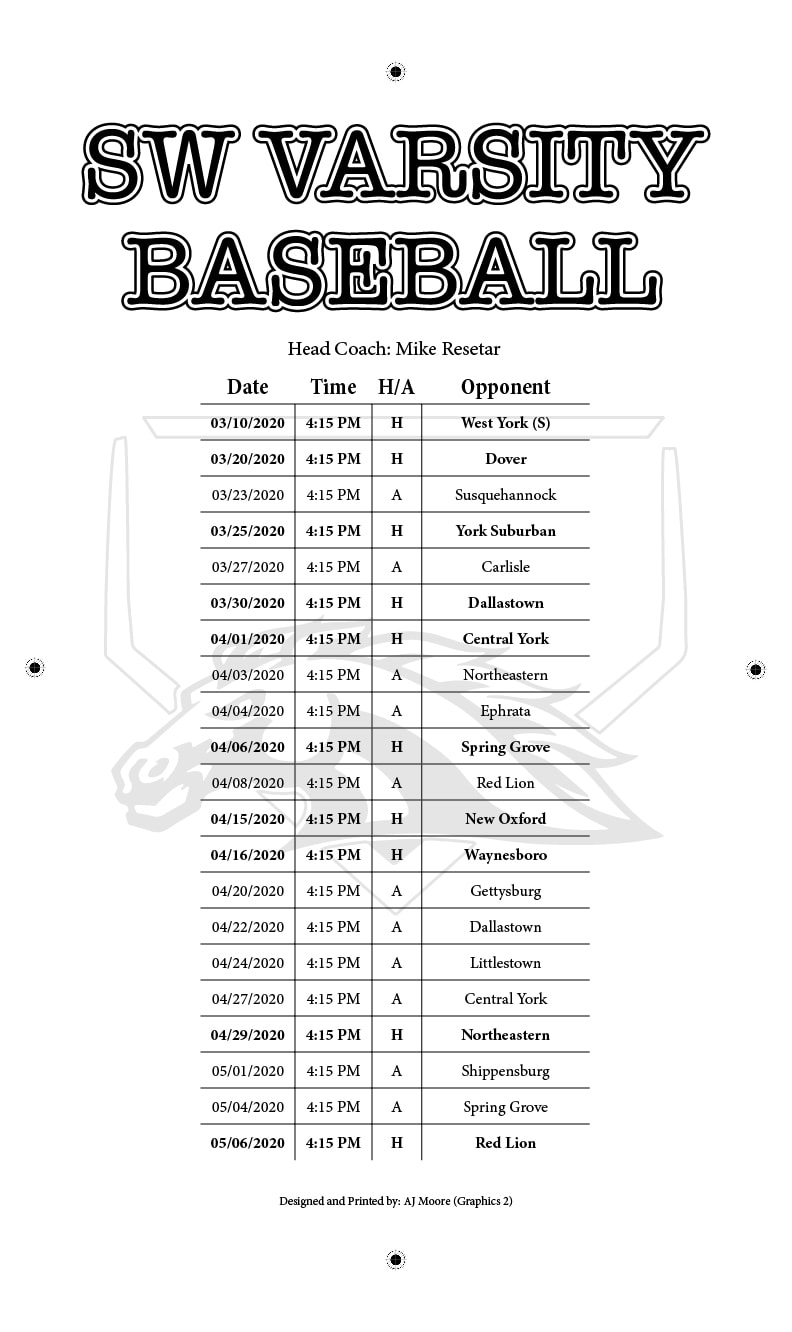
Task: Create, develop and print at least 50 multicolor copies of an athletic schedule/poster for a selected South Western sports team/request on tabloid size paper for display (11x17). The schedules/posters will be distributed to faculty and staff within the school district. Your objective for this assignment is to print a graphic message from the design to finishing stages of product development using multiple colors and registration of those colors.
Planning: This project was not able to be finished due to an issue with the press, but I was chosen to do the schedule for baseball. The school baseball teams uniforms are red, black, and white. Due to this I chose to use the same colors for the project.
Strengths: I like the design I chose and how it was layed out with the schedule.
Weaknesses: If we were able to print I think there may have been a problem with how dark the logo may have been underneath the schedule.
Emblems For Administration
Task: For this project I was told to design four separate graphics for administration that represented (health, human and social services), (business and information management), (science, technology, engineering, and mathematics), and (arts, humanities, and communications). All graphics were to be done in a similar way and style so that none would look out of place next to each other.
Planning: To start I first looked up what each of the subjects could best be represented by. For example, when hearing the topic business and information management, many people can agree that they would think of money, and things around the world. Therefore I chose to place a globe in the background so that it can still be seen but is not the main focal point. I then placed a graphic of two people shaking hands on top to really convey the idea that it is business. After I had done that I placed smaller graphics in each corner that also help convey the idea of business management such as money, paperwork, and other two others.
Strengths: I feel like I did a good job in keeping the same style throughout all four graphics. Each graphic can be easily identified and express each part of what it is meant to do. I think that the science, technology, engineering, and mathematics the strongest graphic out of the four that I designed. It conveys all parts of what its supposed to but I still simple.
Weaknesses: Out of all the graphics the arts one is my least favorite and overall was the hardest to do. For most of the graphics the things fit together well such as science, technology, engineering, and mathematics. However for the arts one I didn't know how to arrange arts with communications effectively while still appealing to the viewer.
Magazine Cover
Task: For this project a magazine cover was to be designed with a table of contents and a article. The magazine cover had to have a Masthead, theme, original photo, 3 cover lines, ribbon/Sticker, price, volume/Issue, and a UPC code. The table of contents needed to have 4 sections, 2 articles per section, 2 original photos, brief descriptions, and page numbers. The article had to have an article header text that is larger than the rest, sub-line under article header that explains article in one sentence that gains reader attention, 2 columns of text, and 1 original photo.
Planning: I had the idea to make a little league baseball type magazine where the article I chose to make described how to be the best player. I titled the magazine Backyard Baseball, this allowed the article to fit into the magazine theme well.
Strengths: Overall I think the project went well and I met all the criteria. I like how I assembled the images on the page. The magazine cover itself was my favorite thing to design during this project.
Weaknesses: The biggest weakness I had was the software I had to use. It made it hard because it was not the adobe based programs I am used to using.
Corona Buster Product Packaging
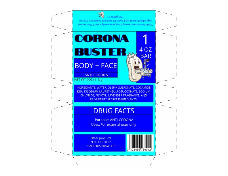
Task: For this project the overall goal was to design a soap package. The name of the soap we had to design a package for was given "Corona Buster." A main label, ingredients, and company info was required. A bar code, weight, slogan, and logo was also necessary for the project.
Planning: When I thought about a soap package in my mind I pictured something blue like water. When I think of clean I associate it with the colors blue. Therefore I decided I would make these the main colors. I looked at a real life soap box for the placement of the UPC, weight, ingredients, and other basic parts. The next main thing to do was design the logo. I chose to make a soap character washing his hands. This also helps people easily identify the product ans associate it with cleanliness.
Strengths: This was my favorite project and was enjoyable to design. It sounds really simple to design a soap package but there are many things that go into it. To construct it so it looks pleasing to the eye but still includes all parts is a challenge. I think mine did all of that which is why it was fun to design.
Weaknesses: The biggest weakness to after viewing it would be the font. The soap logo portrays a fun design but the font does not go along with it. If I changed one thing it would be the font so it went more with the logo and colors.
Movie Poster
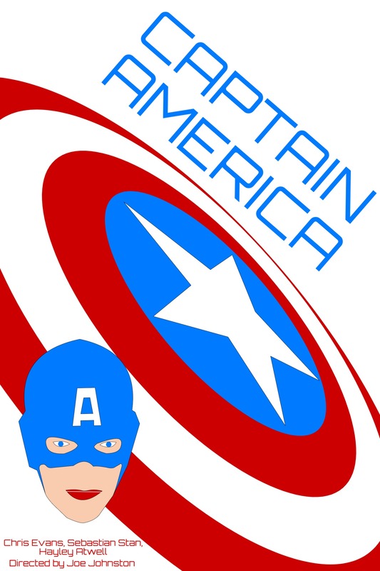
Task: For this project a movie poster was to be made using a program called gravit. The poster was to be designed in a way similar to Saul Bass and his style. Saul Bass (May 8, 1920 – April 25, 1996) was an American graphic designer and Oscar-winning filmmaker, best known for his design of motion-picture title sequences, film posters, and corporate logos. Therefore to keep it simple like Bass, only 4 colors were to be used, and the text should be big and blocky.
Planning: Based off the criteria only 4 colors were to be used. Due to this I began exploring various movie titles that would still look good with limited colors. This was a challenging aspect of the project. I knew I wanted to do a superhero, then I stumbled upon Captain America and began doing thumbnails to get ideas. The main things known in Captain America are him and his shield. I made his shield the main focus and put it at an angle with the text above it at the same angle. I placed a simple version of his face in the lower corner to draw attention to the actors.
Strengths: My favorite thing that I did was how I arranged the shield with the title on the page. It is very appealing to the eye but yet very simple.
Weaknesses: I think the biggest flaw on my project is the Captain America face. Something about it is off and overall I think the poster would look better without it.
Cartoon Tutorials
Task: A program called gravit was used to design 5 images. 6 options were given and only 5 had to be done. I did all of them but the girl because it would have turned out very similar to the boy.
Planning: To do these a video was followed.
Strengths: My favorite one is the creature/monster. I spent the most time on this one, not because it was hard but because I really liked how it was turning out.
Weaknesses: Although it still turned out well, my least favorite tutorial was the dog. I feel like he could have found a way to add some things to make it less simple.
Low Resolution Pixel Art

Task: Using your knowledge learned from the GIMP tutorials previously assigned follow the tutorial below and use GIMP to convert an image of your face into low res pixel art.
Planning: Duplicate the original photo used and work with the copy, erase the background and convert your photo so it looks like something similar to one in the attached screen shot and submit along with original photo.
Strengths: This was a very short and simple project so it either came out terrible or how it was supposed to. At first mine didn't look like me so I had to keep adjusting the amount of pixels until I got it to resemble me a little but still look mostly like pixels.
Weaknesses: I think I should have used slightly more pixels to bring my face out more.
Tutorials
Task: A program called GIMP was used to complete these previously selected tutorials.
Planning: As much as I despised using GIMP, the tutorials were good and easy to follow. They went through various tools and techniques that would be good to know for designing with GIMP.
Strengths: My favorite tutorial was the "SKYLINE". I could see myself using this technique in the future If I ever take more graphics courses.
Weaknesses: The biggest weakness for this project was the lack of skill with GIMP.
