My Projects
Here are the projects I completed in class throughout the duration of Graphics.
Clipart
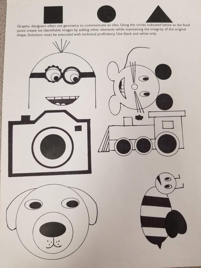
For this project I was required to take basic geometric shapes and turn the into images that appeared as if they were printed. Before I even started my clipart on my final sheet I did 18 (3 sheets) of ideas. Next I used pencil to first sketch my ideas on a separate "practice" packet. I then used a series of french curves, rulers, and a circle template to get the "printer quality" that was desired. After I had the image drawn to my liking I traced it with sharpie, once again using the drawing tools. I like how most of my images came out, however I wish the ears on the dog were more consistent.
Olympic Symbol
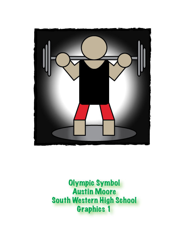
For this project I was required to design an image on adobe illustrator that represented an olympic event. The basis of this project consists of geometric shapes to form an image that should be identifiable in seconds. I chose to do weightlifting for my olympic event. In this project I utilized the shapes tool a lot to provide the "geometric" look that was desired. I liked this project and was satisfied with the outcome of my project. But one dislike I have is the legs, I could've added hips to give more of the illusion that he is squatting.
Low Poly
For this project I was required to take a portrait picture of myself. After taking the picture I used Adobe Illustrator to divide the image into a series of shapes, supposed to be mainly triangles. After dividing the image into triangles i used a series of tools on illustrator to give the image its color. By the end of the project the final result was supposed to resemble the original image. I thought I was successful with the outcome as it does resemble me. I really like how this project actually resembles me, but if I could change something I would've broke my face up into more triangles to make it look more like me.
Monogram
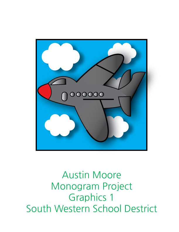
For this project I was supposed to use my monogram (my initials) to create an image that says something about me. I decided to use my first and middle initial to create the monogram on the Image (AJ). It was a challenge in this project to make the monogram visible yet hidden, therefore I chose to embed the A and J into the wings. I chose to do a plane because I like going on planes and traveling. I used many techniques in this project using Adobe Illustrator such as shadows, gradients, layers, and many other tools to form this image. In this project I liked that I chose to add shadows to the clouds as it adds some depth to the image. Although I am happy with the outcome of this project I wish I would've added a more noticeable gradient in the background.
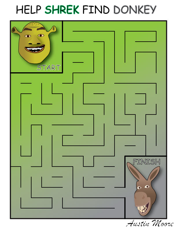
Maze
|
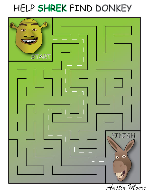
|
For this project I was required to make a maze to entertain someone the age of 4-7. I chose the Shrek theme as it is supposed to appeal to a younger child. The difficult part about this project was making it solvable to a child but not too easy. Above, on the left is the maze, and on the right is the answer key. In this project i utilized and learned new tools in Adobe Illustrator such as snap to point and snap to grid. This allowed me to make the path, path gaps, and answer key all even and appear "professional." I also combined many tools I've used from previous projects such as gradients and different forms of lines. This one was of my favorite projects. The end result of my project looks professional, however if I had more time to work on this project I would have put more detail into the images in the upper left and lower right.
Logo
In this project I was presented with two choices; redesign an existing logo or completely design a brand new logo. Because I wanted to start from nothing I chose to design my own. However before hopping onto Adobe Illustrator I was required to view already existing famous logos. The logos I researched were simplistic and appealing to the eye, but also held a deeper message. While some of the logos were just images and text. In the logo I created, I designed it to be a logo for a fictitious phone company called "SparkTek." In this project i really utilized the layers tool in Adobe illustrator to create the outer ring and give the image a "glow." I am very satisfied with the outcome of this project as it is appealing to the eye and detailed yet still simplistic. If I did this project again I might go with a different color scheme.
Handout One Color Screen Print


For this project I was required to create an image that could later be printed onto a piece of paper. The image first started out on Adobe Illustrator where I knocked out the color using image trace. I then printed the image out and "graded" it on a difficulty level from easy, intermediate, to complex. Due to my image being disconnected in many areas with many small shapes mine was complex. Next I got my piece of green poly, which is a lacquer based screen. I then used an exacto knife to cut out my image which was a long and strenuous process. After it was cut out I adhered it to my screen with adhering liquid and printed it onto paper using a water based ink. I like the colors I picked for printing because it makes the image "pop" off the page. I don't like that I only printed approximately 10, so if I did this project again I would print more to keep.
Textile Screen Print
|

|
This project also consisted of a screen printing process, which is the process of forcing ink through a screen onto a substrate to repeatedly reproduce the same image. This image was also was created on Adobe Illustrator. However the screen this time was blue poly which is a light sensitive material that is water based. In this process the image did not need to be cut, but was instead "burned" into the poly using the plate maker. After the plate maker the image went through a series of other things before it was printed. I printed this image using a plastisol ink and my substrate was a t shirt because this ink is meant for textiles. I like the design my partner and I came up with but in the printing process we made the image a little off center. So if I reprinted I would center it more.
Notepad

|

|
For this project I was required to design an image on Adobe Illustrator. After designing the image I printed it out on a plate that has micro scratches on it that holds water. This is necessary because I used the offset printer to reproduce this image onto paper. The process works based off the idea that water and oil dosing mix. After going through the process of the offset printer the papers were blinded together to create a notepad. There note pad was then cut and trimmed using the heavy duty paper cutter. I really like the idea I came up for with this project and how I played it out onto the page. However I wish the llama in the background was more noticeable.
Tutorials
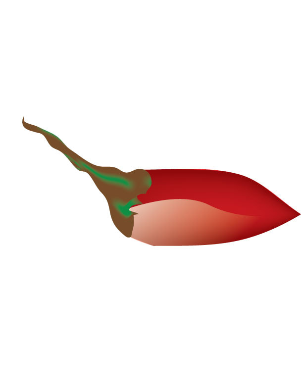

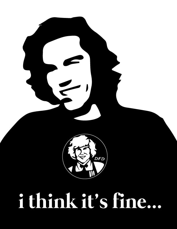
Throughout the class when i was presented with free time by completing projects early, I was able to complete some tutorials. I like these two as one was challenging and taught me some new techniques on Adobe Illustrator, and the other I liked doing because it shows that something really simple can create a quality image. The pepper consisted of many colors to make the shades and "shine" on it. However the phone was much more simplistic and only required simple shapes and one color. I liked the chili pepper because it taught me some new techniques but i don't like how the stem looks. The phone I like because it was really simple but I wish it had more detail.
